A growing number of Ted Cruz supporters are checking their smartphones every day, in an effort to gain points and make their way to the top of the "Cruz's Crew" leaderboard. Online communities are weird. These points are seemingly worthless to the individuals earning them, beyond the in-group signalling value among "Cruz's Crew." Yet people are willing to trade their friend's (sic) contact information for them.
If this is successful as an information gathering tool, it seems likely many more (and more well polished) versions will be popping up in other campaign apps. What other domains might we see this -- maybe religious or music groups? Does its success mean we shouldn't take seriously the new branch of experimental economics that uses games to make inferences about various economic theories?
9 Comments
I am a big fan of maps, and have only recently begun playing around with them. I am also a big fan of ethnic food, and am going to be traveling around the U.S. a fair amount in the next couple months. In an effort to guide my search for ethnic food and get more practice with maps, I created maps of foreign born populations in the United States using Census American Community Survey data. These are pretty rudimentary, but are my first swipe. Examining the distribution of Vietnamese people throughout the U.S. seemed like a good starting point. I enjoy Vietnamese food, and for a couple reasons the U.S. is home to a relatively large Vietnamese population. This is a simple county-level count of individuals born in Vietnam. 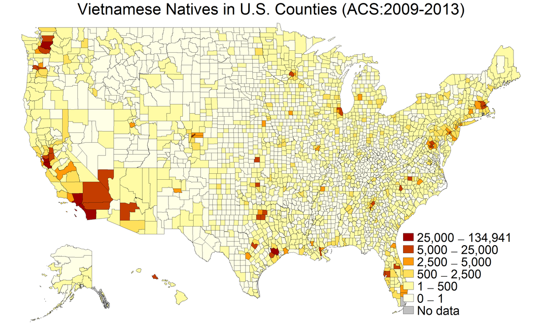 A few things jump out from this map. First, as expected, large urban areas on the coasts have size-able Vietnamese populations. Farther inland, Minneapolis, Chicago, and Dallas-Fort Worth also show up. Second, there are decent sized Vietnamese communities in smaller cities throughout the Midwest. However, we might be worried this is more of a population density map than anything specific to Vietnamese populations. Also, the counties in southern California and Nevada are gigantic. So next up is a graph of the percentage of each county that are Vietnamese. 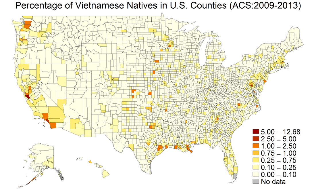 Notice the counties in the middle of the country where the populations are large in percentage terms: Sioux City, Omaha, some places in Kansas. These towns and cities are dominated by people of Germanic heritage. Naturally, the restaurants in these cities cater to people with Germanic palettes. Realizing there are likely good Vietnamese restaurants in these areas might offer some much needed flair.
Twitter is a great place to be wrong, because smart people often correct you in real time. That happened yesterday, when I commented on this graph tweeted by David Andolfatto: 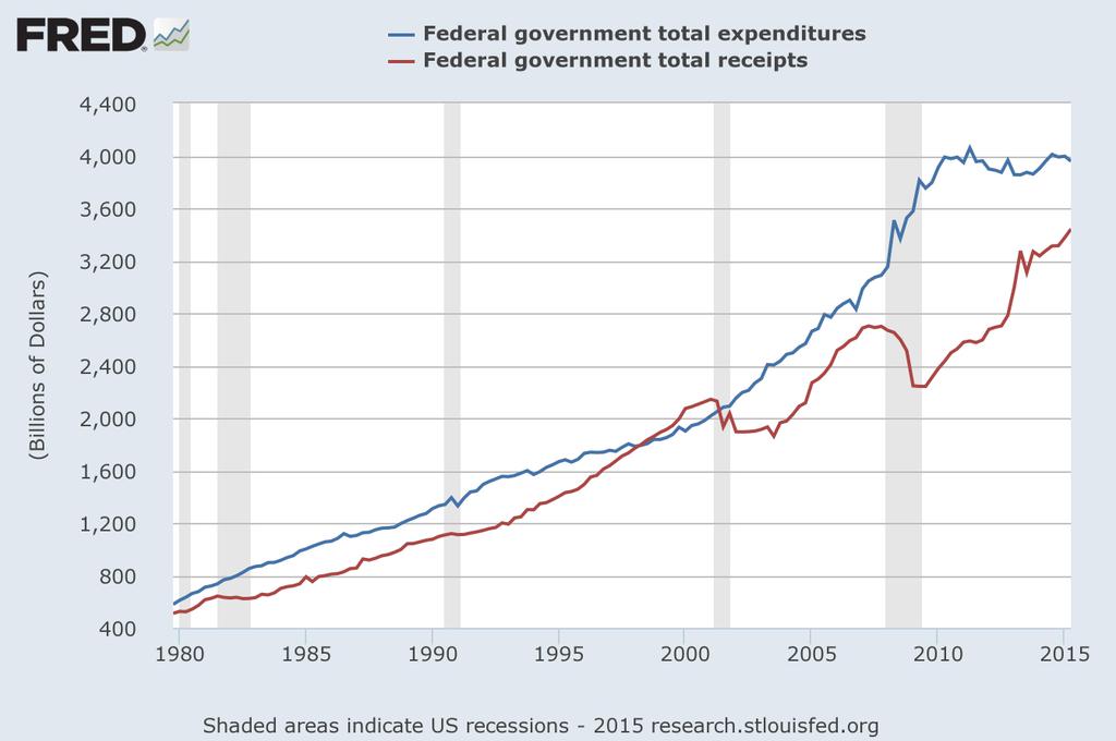 Nominal federal government expenditures over time are plotted along with nominal federal receipts. Noah Smith (and David, at least implicitly) was making the case that net government outlays had returned to pre-Great Recession trend. I suggested that the current levels remained above trend despite spending growth being negative in real (inflation adjusted) terms. David suggested I check the same graph out in real, per capita terms. This seemed like a good opportunity to work with some macro data, which I rarely do, and add an inaugural post to my blog. Here is what I did to create the graphs below:
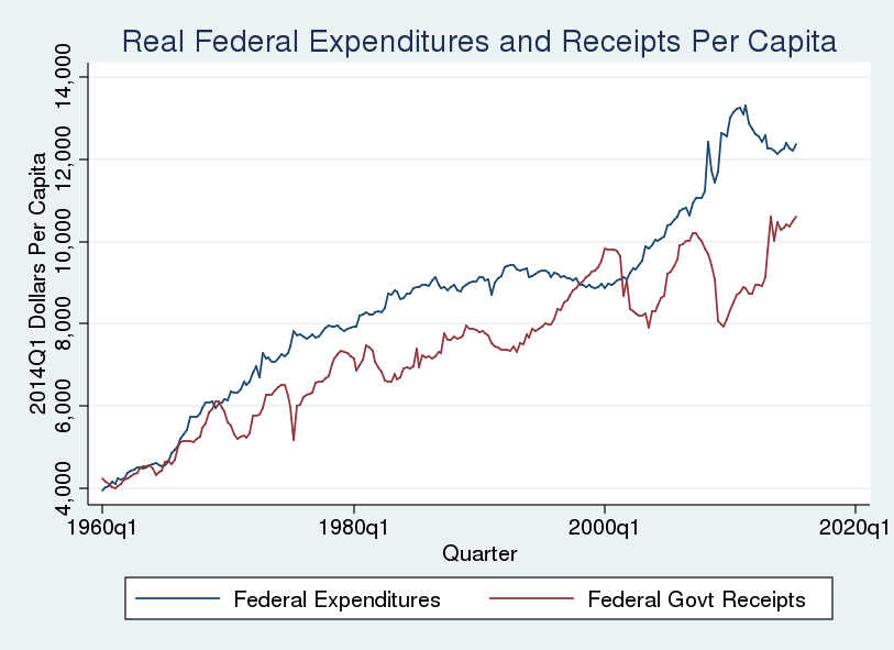 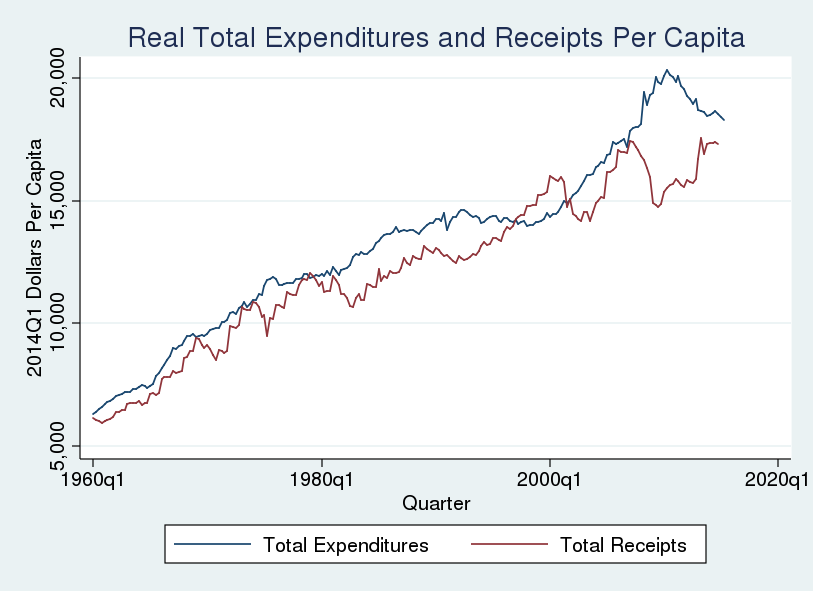 These graphs tell basically the same story as David's. It is obvious the Great Recession generated large deficits, and that those deficits have shrunk in the years following the stimulus response. But how large are current deficits relative to those before the Great Recession? To better answer that question I graphed the difference between real per capita expenditures and real per capita receipts. 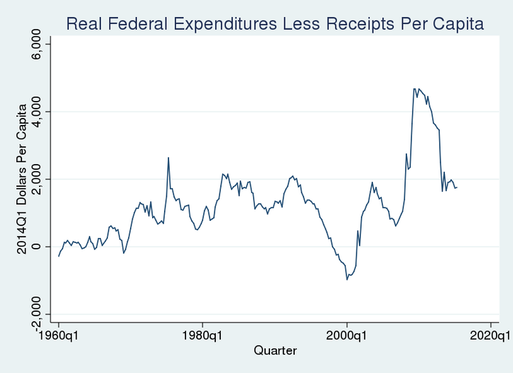 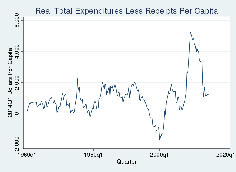 What do these graphs tell us? The real per capita surpluses at the end of the last century represented a substantial deviation from the trend beginning in 1960. Similarly, the deficits during the Great Recession were substantial. And deficits in recent quarters are approximately at the levels of 1980s (AKA the Reagan Glory Years). This means my "eye-balling a graph while leaving a winery after moderate day-drinking" self was wrong: we have returned to deficits that are roughly on trend. Mea culpa -------------------------------------------------------------------------------------------------------------------------------------------------------- A few notes on the construction of these graphs:
|
AuthorSee my research page for working papers and publications. ArchivesCategories |
||||||
 RSS Feed