|
Twitter is a great place to be wrong, because smart people often correct you in real time. That happened yesterday, when I commented on this graph tweeted by David Andolfatto: 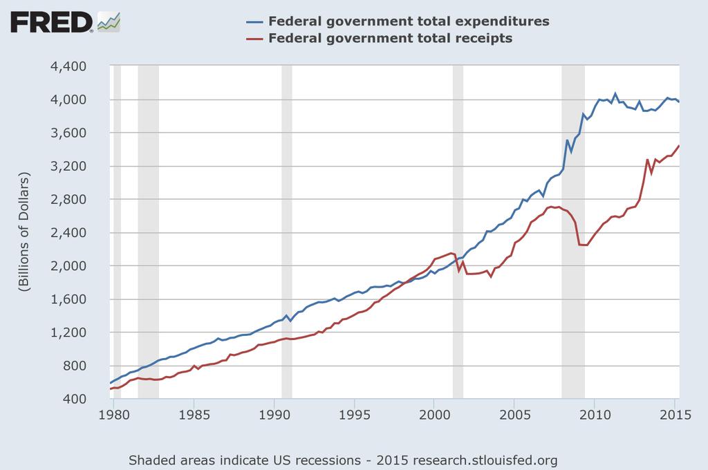 Nominal federal government expenditures over time are plotted along with nominal federal receipts. Noah Smith (and David, at least implicitly) was making the case that net government outlays had returned to pre-Great Recession trend. I suggested that the current levels remained above trend despite spending growth being negative in real (inflation adjusted) terms. David suggested I check the same graph out in real, per capita terms. This seemed like a good opportunity to work with some macro data, which I rarely do, and add an inaugural post to my blog. Here is what I did to create the graphs below:
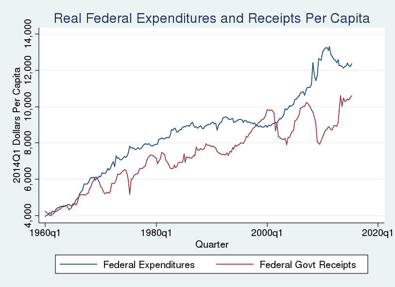 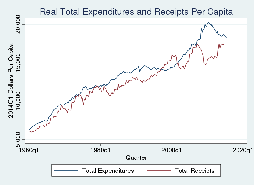 These graphs tell basically the same story as David's. It is obvious the Great Recession generated large deficits, and that those deficits have shrunk in the years following the stimulus response. But how large are current deficits relative to those before the Great Recession? To better answer that question I graphed the difference between real per capita expenditures and real per capita receipts. 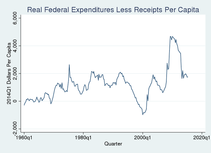 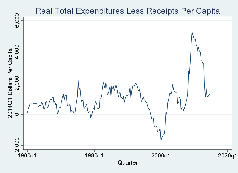 What do these graphs tell us? The real per capita surpluses at the end of the last century represented a substantial deviation from the trend beginning in 1960. Similarly, the deficits during the Great Recession were substantial. And deficits in recent quarters are approximately at the levels of 1980s (AKA the Reagan Glory Years). This means my "eye-balling a graph while leaving a winery after moderate day-drinking" self was wrong: we have returned to deficits that are roughly on trend. Mea culpa -------------------------------------------------------------------------------------------------------------------------------------------------------- A few notes on the construction of these graphs:
6 Comments
|
AuthorSee my research page for working papers and publications. ArchivesCategories |
||||||
 RSS Feed